I recently decided to learn PowerBI. In my search for a job I have noticed that many employers prefer their candidates have some sort of experience using either PowerBI or Tableau. So, I thought what better time to learn than now, and what better way to learn than making some sample dashboards (along with taking some Datacamp courses)!
I was pleasantly surprised with my initial foray into the world of data visualization using PowerBI. Its quite user friendly, especially compared to coding languages like R or Python which require fairly in-depth scripting knowledge to make detailed visualizations. I was also impressed by its flexibility. In its basic form PowerBI allows the user to take previously prepared datasets and simply and easily create interactive and aesthetically appealing graphical representations of data. More advanced features allow the user to create formulas (similar to excel), modify datasets, run code from R, Python, etc., and more. In this post I will create a dashboard using sample retail sales data to highlight some business insights. This dataset (and several others) are available from Microsoft’s PowerBI site for free.
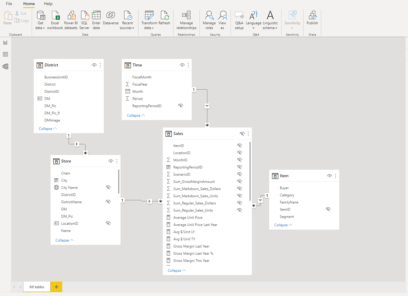
There are three main views in PowerBI that allow the user to understand their data and create a dashboard. The “model” window provides a graphic overview of the relationship between all of the tables and variables in the dataset. The dataset we will use has five separate tables, and each table is related to one other table with one variable.
The “data” window displays data from a single table at a time in an Excel style format. This is a convenient window to do some quick sorting and filtering.

Finally, the “Report” window houses all the tools needed to build an engaging set of visualizations. Notice that multiple tabs can be added along the bottom, again similar to Excel.
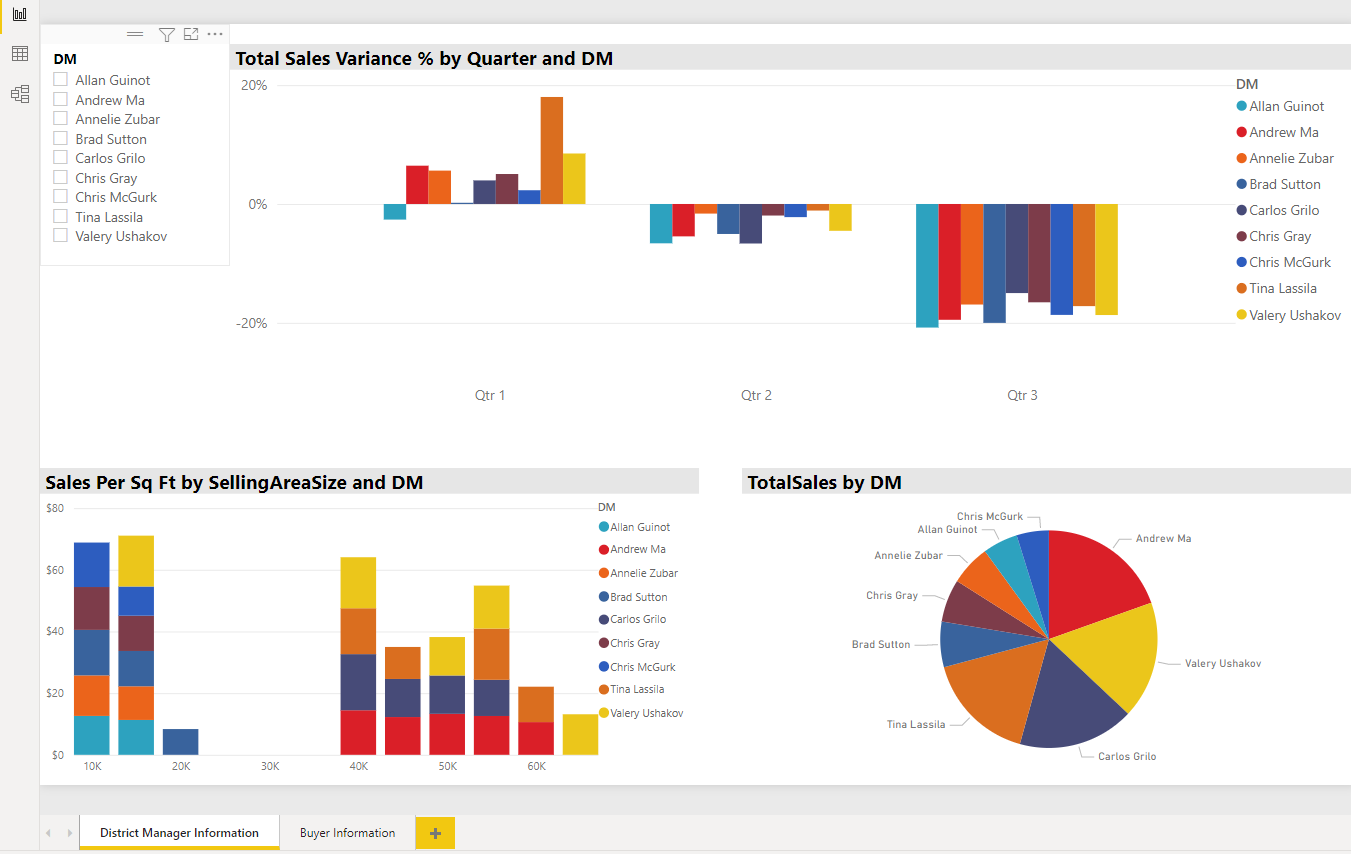
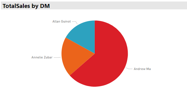
Alright, let’s focus on the “Report” window and see what these visualizations can tell us about what’s going on with this retail business. The image above is a set of visualizations focused on understanding the performance of the nine district managers in this company. Notice there is a slicer that we can use to select any number of managers, making it easier to focus on just one, or to easily compare the performance of multiple managers.
For example, let’s say we want to compare the performance of Allen, Andrew, and Annelie.
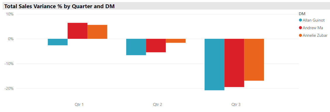
Let’s first look at the sales variance. Total sales variance is the difference between expected sales revenue, and the actual sales achieved. So, positive percentages means sales were better than expected, while negative numbers mean managers missed sales goals. We can see that all three mangers missed their sales targets by a large margin in quarter 3, but that Allen had some trouble in quarter 1 also, even though his peers beat sales expectations. Hmm, let’s see if we can dig a little deeper to see if we can get some more information on why this might be.
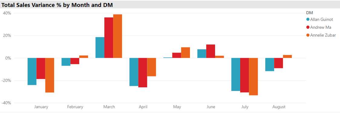
PowerBI has a feature that assigns a hierarchical structure to dates which allows us to move up or down that hierarchy to view our data from smaller or larger grain sizes. We can now see that quarter 1 was the best quarter mainly because in March all managers beat their sales estimates by a large margin, and quarter 3 was so poor because in July sales fell quite short of estimates. We can also see that compared to his peers Allen did not do nearly as well in March, resulting in his missing sales estimates for quarter 1. Well, it just so happens that in our fictional example Allen went on a long vacation during March and was not around to monitor his staff.
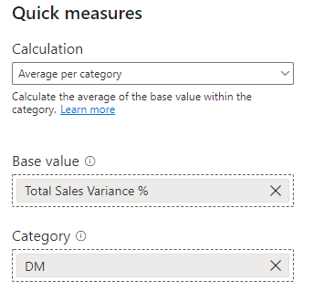
However, after viewing this data now we are now thinking about the average variance throughout the entire year for each manager. Which of these three managers is performing the best in relation to their expected sales? Even though there is no variable in the dataset for average total sales variance, we can easily calculate one using PowerBI’s “Quick Measures” tool.
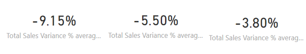
We can then add a card to our dashboard that shows a manager’s average total sales variance over the entire year. Note that this calculation will take the average of whatever is selected on the slicer, so if we have three managers selected it will take the average all three managers’ total sales variance. Probably better to select one at a time. Using our new measure we can see that Allen does has a noticeably lower total sales variance than the Andrew and Annelie, and that Annelie is performing the closest to her sales expectations. Perhaps we need a meeting with Andrew….
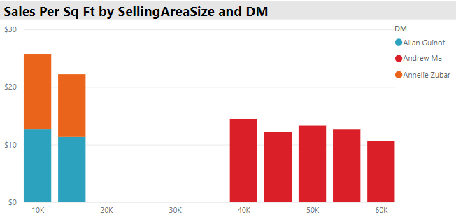
Maybe we are also interested in the association between store size and sales per square foot to get an idea about what size store footprint offers the most efficiency in terms of sales revenue. From the graph below we can see that, generally, smaller stores seem to be more efficient than larger stores. They generate more sales per square foot than larger stores. Perhaps its time to look at our product selection in larger stores to see if we can replace some poorly selling items?
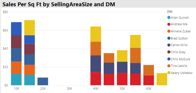
In terms of our three managers we can see that Andrew runs only larger stores, while Allan and Annelie exclusively operate stores under 20,000 sq. ft. This could be due to a number of factors such as experience, past performance at certain store sizes, or geographic location.
Finally, we can look at the total sales by manager and see that Andrew’s stores sell more than Allan and Annelie’s stores combined, perhaps unsurprising given that Andrew manages much larger stores, which bring in more total revenue, even if they are not the most efficient in terms of sales per square foot.
Alright, now that we have some information on the performance of various district managers we are interested in comparing how much our buyers spend with us, and what category goods they tend to purchase. Here is a dashboard we can use to answer some of those questions.
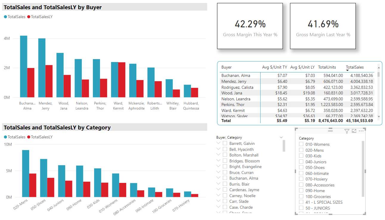
On this dashboard the two graphs compare total sales from last year and this year by buyer and by category. The cards give the gross margin last year and this year, the tables provides a few more pieces of useful information about the buyers, and the slicers can filter the data by buyer or by item category. A couple of things to note. The total sales by buyer graph is set to only display the top 10 buyers at any one time (all categories are included in the total sales by category graph), and the table is sorted in descending order by total sales.
There are many questions we could investigate using this dashboard, so we will just focus on a couple. Let’s say our company wants to start focusing more on kids clothes. When we filter the dashboard to view only sales of kids clothing and we see that Elizabeth stands out this year as the top buyer. Not only was she the top buyer of kids clothing this year, she went from about $350,000 in purchases last year to almost $2 million in purchases this year. We might want to get in touch with her to see what she is doing differently this year which has resulted in such a large increase in kids clothing purchases.
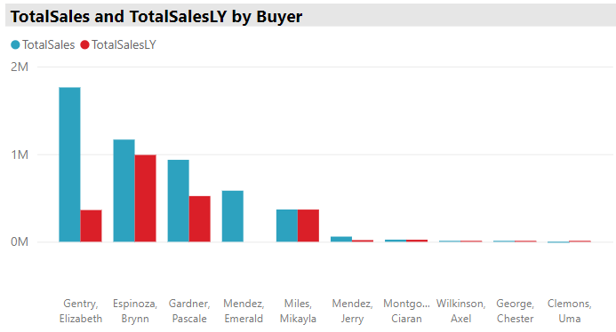
Hmm, now maybe we are interested in understanding what items some of our top buyers are purchasing. Let’s select the top three buyers by total sales using the table, and take a look at the total sales by category graph
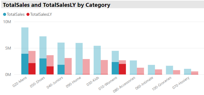
Wow! We can see that the top buyers account for around half of the total sales of Mens, Womens, Juniors, and shoes. It might be worth having a conversation with these buyers to learn what they are doing to sell such large amounts of products in these categories, so we could pass along any helpful insights to our other buyers. This might also spark a more detailed examination of our product line. If our largest buyers are selling mostly these four categories, does it make sense for us to continue offering small product categories like groceries or accessories?
Hopefully this was a useful introduction to PowerBI that demonstrated a couple of simple dashboards that can help to visualize and answer some basic business questions!
***If you want to check out the data and dashboard in this post visit the Github repository.***
