Choosing the appropriate type of visualization and creating an engaging dashboard are oftentimes not as straightforward is it might seem. The powerful visualization tools that are readily available and relatively easy to use has given anyone with the time and desire the ability to create professional looking visualizations and dashboards. However, creating pretty graphs and diagrams is only half the battle. Sure, you want your visualizations to look great, but what’s really important their ability to communicate effectively and tell a story.
We can look to psychology and the concept of “cognitive load” to help us start to think about how to create easily understandable visualizations. However, first, its useful to consider the basics of human memory. There are three broad types of memory: sensory memory, long-term memory, and working memory. Sensory memory refers to the processing and interpretation of sensory information from our environment (e.g. sights, sounds, smells, etc.). Long-term memory is just as it sounds; the type of memory that stores information for long periods of time.
Working memory is what we are most interested in when considering how to design visualizations and dashboards. This type of memory refers to the information that is held in the mind and used to perform cognitive tasks. Its what we use when we are actively “thinking”, learning something new, or trying to understand data.
Unfortunately, working memory has quite a small capacity to hold and process information. In fact, some research suggests that humans are only able to hold between 5 to 9 items in their working memory at one time, and recent research suggests it may be even less. As an interesting exercise try to remember the following numbers.
461562663764
461 562 663 764
Which was easier? Probably the second one, since the large number is “chunked” into sets of smaller numbers, and our mind counts each chunk as only one item.
Since our mind has limited capacity we want to minimize the visual clutter the brain has to sift through when creating a dashboard. We want our viewers to understand the data quickly and easily. Cognitive load is a term describing the amount of working memory that we have to dedicate to tasks. There are two types of cognitive load. Intrinsic load is all of the information we are trying to learn and understand. The data on a dashboard and the story it is communicating. Extraneous load is all the “other” stuff not related to what we want to learn or understand. Therefore, we want to design our dashboards to minimize extraneous load, freeing the mind to focus on understanding and interpreting the data.
So, what do we need to consider when choosing visualizations and designing dashboards?
- Choose the appropriate visualization to best represent the data and tell a coherent story
- Reduce distracting elements of visualizations that do not aid in understanding
- Add visualization elements that HELP in understanding the data
- Think carefully about the positioning of visualizations and the importance of white space
- Tell one story at a time
One of the most important decisions when designing a dashboard is the type of visualizations to use. Different visualizations are more or less appropriate and effective depending on the story you want to tell, and your audience.
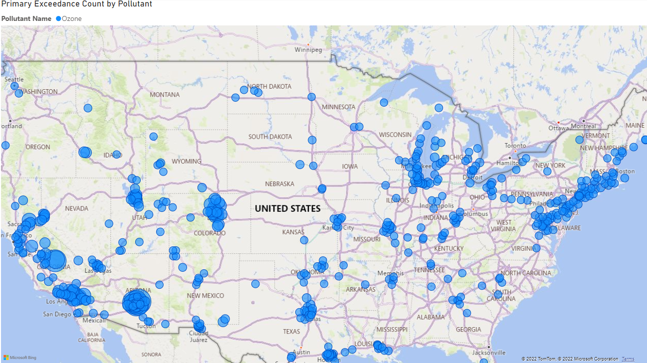
For example, let’s say we work for the EPA and need to create a visualization describing levels of ozone pollution around the country. If our primary goal is to design a visual that gives the general public an overall feel for ozone pollution across the country using a map would make sense. It is easy for the viewer to quickly see that the east and west coast house the most ozone (probably correlated with population).
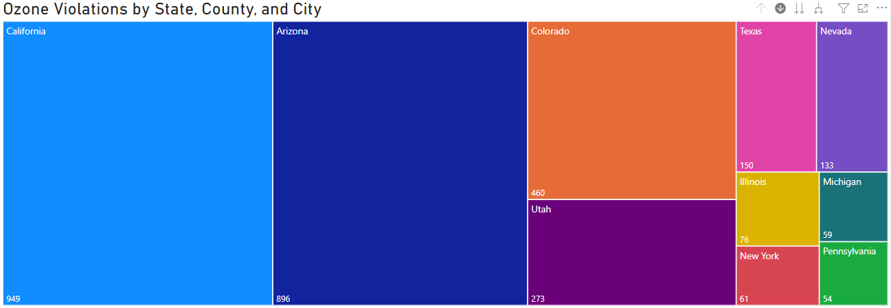
Now instead, maybe we now want to design a visual for a public facing website that gives viewers specific information about the number of times ozone pollution has exceeded EPA standards by state, county, and city. A Treemap with a hierarchical structure does this quite well. There is a page level filter for ozone, and the treemap includes the ten states with the most ozone standard violations. Using the drill-down function we can see which counties and cities in these states are the largest contributors.
Finally, let’s imagine we want to communicate the number of ozone violations with other EPA researchers who are familiar with the general trends of the data and really need to understand which states, counties, and cities have the most violations at a specific and fine grained level. A decomposition tree is a good choice here.
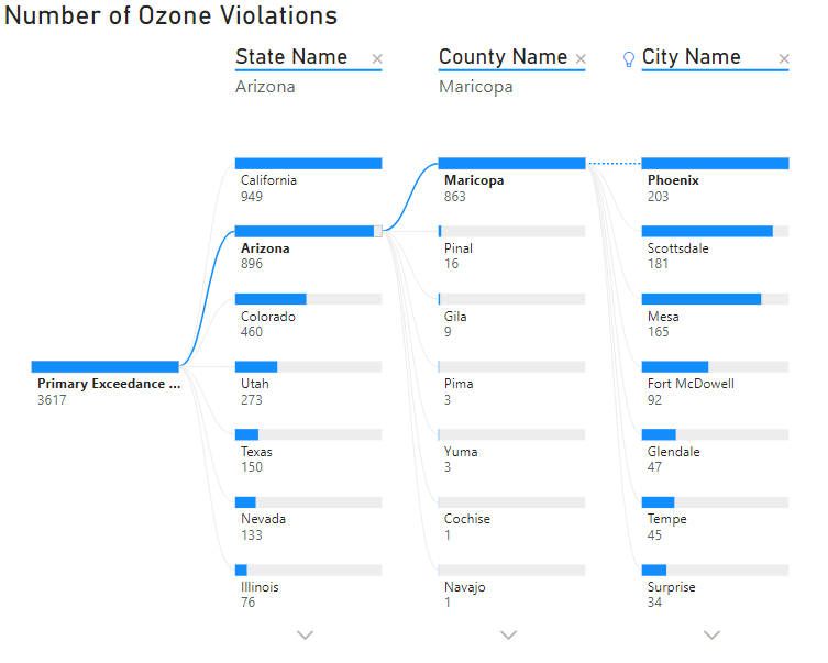
Since each state, county, and city is ranked from largest to smallest the viewer can quickly identify top contributors to standard violations at the state, county, and city level. We can see that almost all of Arizona’s violations can be attributed to Maricopa county, specifically Phoenix, Scottsdale, and Mesa. Insights such as this would be much more difficult using a geographical map or treemap.
When choosing aesthetics for visualizations its important to consider how the various visual elements either contribute to, or detract from, the viewer’s understanding. Below we see the same decomposition tree as above, but with different aesthetics.
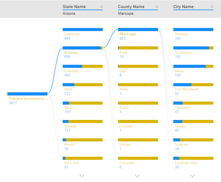
Right away we can see that the second decomposition tree takes much longer to understand and places a much higher extraneous cognitive load on the viewer compared to the first one. There are a few noticeable differences between the two trees.
The first tree has a descriptive title, while the second tree has none. Titles and labels are super useful to help your viewer quickly and easily understand what the figure is meant to communicate. Next, notice the color choices on each tree. Excessive color, or adding color without purpose for it, is a surefire way to add unnecessary cognitive load for your viewer. The yellow portion of the bars and colored text does not aid in interpretation, and in fact probably makes the tree more difficult to understand. Finally, notice the difference in the tree header. The first tree has slightly larger headers to make them subtly stand out, while the second tree has small header text with a gray background. The gray background does not increase understandability and is therefore unnecessary.
Our final two considerations are the amount of whitespace on our dashboard, and what story we are telling with the data. Often these two concerns are intertwined since attempting to tell multiple stories on a single dashboard nearly always results in several visuals competing for space, with little room for blank canvas. As a general rule we want to make sure our dashboard does not feel cramped, and we should only be telling one story at a time with our data. Trying to do more than that results in unnecessary extraneous cognitive load as the viewer attempts to make sense of all the visualizations and comprehend multiple stories simultaneously. Take a look at the two dashboards below.
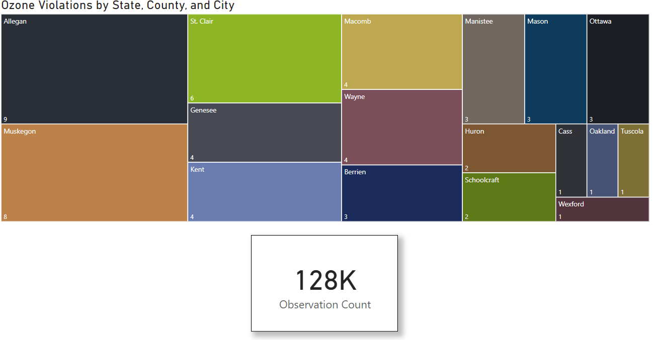
The image above has a page level filter for ozone. It is currently drilled down to the county level in Michigan to show the number of times in each county that Ozone levels exceeded the threshold value. The card at the bottom displays the total number of times Ozone levels were recorded in Michigan during 2021. This dashboard leaves an appropriate amount of whitespace, and clearly and succinctly tells a story about ozone exceedance at the state, county, and city level. Compare to the dashboard below.
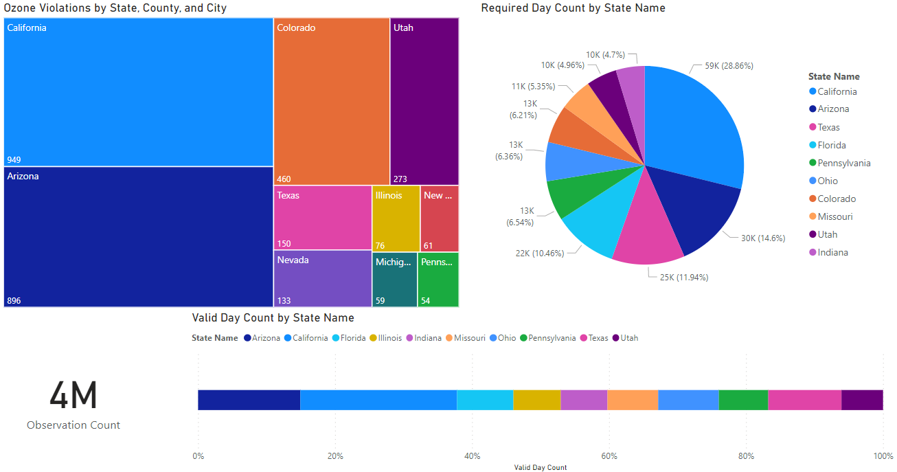
Oh wow, look at all those pretty colors! When viewing this dashboard it immediately becomes overwhelming as your brain tries to process all the colors, text, and variety of graphics. It is also not terribly clear what this dashboard is trying to communicate. There is something about Ozone violations, two separate visualizations reporting observation counts by state… and a seemingly random card in the lower left corner that is displaying…total observations? Very unclear, confusing, and places a high extraneous cognitive load on the viewer.
So, what’s the takeaway? Consider working memory and cognitive load when designing dashboards. Make sure you choose appropriate visualizations for the type of data you have and the story you want to tell, eliminate elements of your dashboard that do not contribute to understanding, judiciously use aesthetics to enhance understandability of your dashboard, not detract from it, think carefully about whitespace, and tell one story at a time.
Now get out there and tell an engaging story!
***If you want to check out the data and dashboards in this post visit the Github repository.***
